The FP&A Trends Webinar: Mastering Analytical Transformation with FP&A Trends Maturity Model
Click here to view details and register

The FP&A Trends Webinar: Mastering Analytical Transformation with FP&A Trends Maturity Model
Click here to view details and register
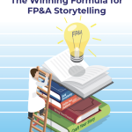
Data storytelling is one of the most critical skills for FP&A. It brings data to life, transforming it into accessible, effective visualisations and building narratives that explain it so that decisions can be influenced and strategic action can be inspired.

FP&A can leverage their data stories through the following three steps:
Data alone makes presentations boring and not engaging. Add context to make data meaningful. Create data visualisations in order to help the audience understand the numbers. Use clear and simple visuals that everyone is familiar with instead of complex and fancy charts. Data should also have a narrative around it to explain the meaning behind the numbers, engage the audience and make the message both sticky and memorable.

Data is meaningless without context. To impact stakeholders, FP&A need to add context to their story through comparative numbers, for example, benchmarks, competitor analysis, prior period figures and trends. To add powerful and effective context to data stories, FP&A need to find the answers to several questions:
By answering these questions, FP&A will be able to add the proper context with an appropriately tailored tone, language, and level of detail.
Humans process visuals 60,000 times faster than text. People can retain visual information at a rate more than 3 times higher than the rate at which they can retain text alone. Our brains see words as pictures, not individual letters. As a trusted business advisor, FP&A need to turn data (numbers and words) into visual elements such as charts, graphs and maps. It would substantially improve the quality of communication between FP&A and stakeholders. Six types of visuals can foster this communication.
Simple text can be the best way to communicate when you have one or two key numbers to share. Make the value big enough to catch attention and stand out, and then add supporting context to make your point.

Simple tables are a great tool when you have multiple different units of measure. Arrange your items to start with the most important ones and use light table borders or simply white space to keep the attention on the data.

You can use a heatmap when you want to leverage coloured cells to convey the relative magnitude of the illustrated numbers.

A line graph is a great option when you have to show a single series, two series, or multiple series of data. Avoid comparing more than 5 lines in a chart. Ensure the colour of the focused line is different to the others.

When you need to quickly show which category is the biggest, which is the smallest, and the incremental differences between them, a bar chart is a great option. Use horizontal bar charts when the category names are long.
6. Map
This shows data spatially to help illustrate concepts such as trends across geographic regions or a specific location’s impact on the relevant outcome.
To make the story both sticky and memorable, FP&A should ensure the following:
Technology has given us more data and more sophisticated visualisation tools, yet data cannot speak for itself. FP&A has to learn the best practices in data visualisation and master the art of storytelling by understanding how to use the combination of data, visuals and narrative available today. This will enable FP&A professionals to build impactful data stories, influence decision-makers and lead clear change as trusted business advisors.
This article was first published on the Unit4/Prevero blog.

In this video, Ivan Mitringa, Worldwide CFO Displays, Software & Client Peripherals at Dell, explains...

Data storytelling is a growing trend that is picking pace with each passing day. In his...

In this short video Ron Monteiro, Corporate Director of Finance at Kruger Products L.P., outlines a...

What is your data literacy level? Everybody agrees data visualisation is powerful. This article will guide...

On the 9th of March, Larysa Melnychuk hosted an inspiring webinar about FP&A Data Visualization: Moving...
In this paper, we lay out the key elements of FP&A storytelling and provide practical guidance...
We will regularly update you on the latest trends and developments in FP&A. Take the opportunity to have articles written by finance thought leaders delivered directly to your inbox; watch compelling webinars; connect with like-minded professionals; and become a part of our global community.