The FP&A Trends Webinar: Mastering Analytical Transformation with FP&A Trends Maturity Model
Click here to view details and register

The FP&A Trends Webinar: Mastering Analytical Transformation with FP&A Trends Maturity Model
Click here to view details and register
In my last article, I listed four questions you should ask yourself, and the order you should ask them in, if you are an FP&A professional considering using data visualization to communicate your information. In this article, we address Question #1: Which is the most effective way to impart your key information – a table or a graph?
To consider this question, let’s actually start with a graph, one that will be familiar to anyone who has worked in FP&A. It shows P&L results of the Vaporware and Software Technologies Corporation (VASTCo), a fast-growing software company:
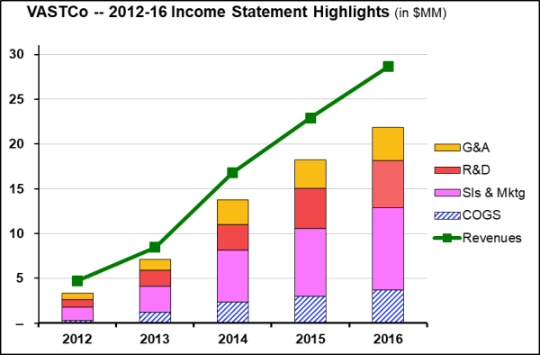
The layout is straightforward: major expense categories are in stacked columns, and revenue is graphed as a green line. The distance between the top of the expense column and the revenue line is VASTCo’s operating income. The design is clean and clear, and generally meets the standards prescribed for graphical clarity. Now, study it carefully – take as long as you want – then turn away from the screen and ask yourself the kind of questions a typical FP&A professional needs to address, such as:
In fact, other than observing that many of the P&L numbers were growing rapidly, what did you learn from the graph? If the answer is “very little,” is that just because you’re not a “visual person”? I doubt it – in fact, sometimes it’s remarkable just how little graphs actually tell us.
Now let’s take a look at the same information, this time in a table:
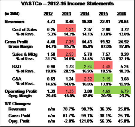
In roughly the same amount of space as the above graph, this table presents more data – the raw $$ figures, plus those raw $$ as a percentage of revenues, plus some year-over-year growth rates – and with greater precision than you could possibly get from viewing a graph. In fact, these metrics – or key indicators, or ratios, or whatever you want to call them – are often more effective than graphs and other data viz techniques for driving your points home.
To enhance readability and emphasize key data, this table uses boldface and indented text to highlight the most important rows, and uses Conditional Formatting to shade cells green (or red) to highlight expense and profit numbers that, as a percentage of revenues, improved (or worsened) by more than 2.0% compared to the previous year. Yes, tables can employ data visualization as well!
Graphs are an immensely powerful presentation tool. But there is a central truth: Graphs work best when you are trying to demonstrate a trend or a pattern. For almost all other purposes, consider tables instead. This use of graphs is illustrated by one of my all-time favorites, created by the late Hans Rosling for the Gapminder website:
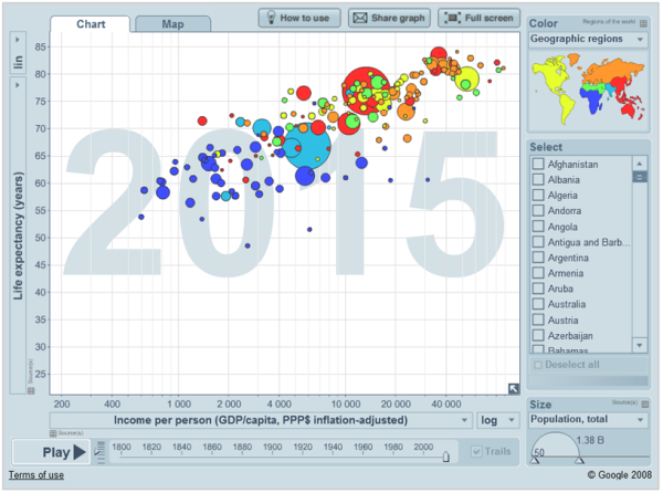
Here, Rosling is showing a correlation – which, after all, is a type of pattern – between a country’s GDP per capita and the life expectation of its people. As slick a presentation as it is – visit the site to see some amazing interactive features – it’s fundamentally making a single, simple, uncomplicated message that’s ideally suited to data visualization.
(By the way, imagine the kinds of information this type of graph, called a bubble chart, could present. For example, a bank could compare each branch’s loan default rates to the average household income of its borrowers, with each branch’s data point sized in proportion to its loan portfolio.)
Ultimately, when considering how information should be presented, the only criterion any FP&A professional should consider is how well that information will be understood by his/her audience. It’s not about your skill using the software tools, or about how “pretty” the information is, nor even what some in your audience claim about their cognitive preferences. (e.g., “I’m a visual person.”) And the first, and perhaps the most important, question to ask yourself is whether your information really lends itself to data visualization.
The article was first published in prevero Blog

When the graph is the right way to present your FP&A information, several important questions should...

Well-designed incentive compensation plans – especially sales commission plans – are an incredibly powerful way to...

Let’s take a look at some of the most messed-up, incomprehensible recent examples of quantation. Not...
We will regularly update you on the latest trends and developments in FP&A. Take the opportunity to have articles written by finance thought leaders delivered directly to your inbox; watch compelling webinars; connect with like-minded professionals; and become a part of our global community.