SWTCH by Pigment
Three days of predictions, insights, and advice from leaders in finance, sales, HR, supply chain and more
Register now here

SWTCH by Pigment
Three days of predictions, insights, and advice from leaders in finance, sales, HR, supply chain and more
Register now here
By Randall Bolten, longtime Silicon Valley CFO, author of "Painting with Numbers: Presenting Financials and Other Numbers So People Will Understand You” and adjunct professor at U.C. Berkeley Extension.
What is the best way to present the FP&A information graphically? Again, the answer is far from obvious; all too often, FP&A professionals give little or no thought to this important question.
Let’s start with a typical FP&A report:
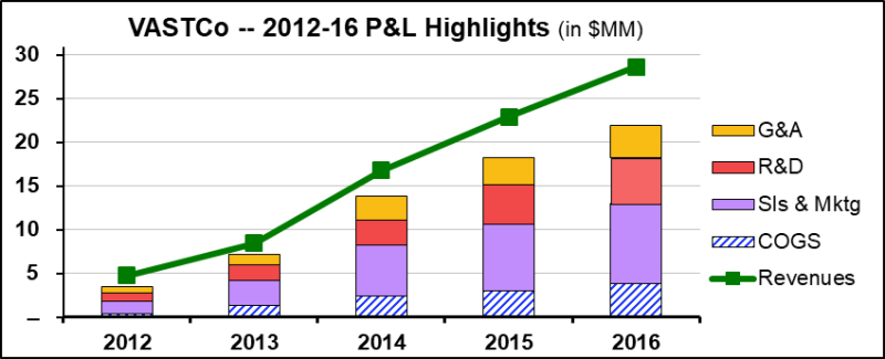
The viewer gets a good sense of total revenue growth, and the gap between the stacked expenses and the revenue line shows how profitability has evolved. Unfortunately, it’s not at all helpful if you want to know how the individual expense components have changed – not only are those graph elements too small to measure visually, they all (except for COGS) start in different vertical positions. So let’s try again:
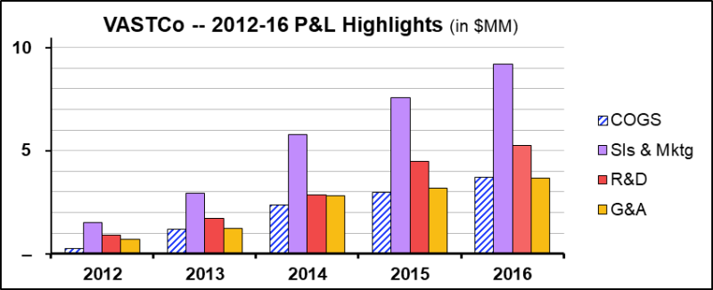
Now we actually can see how each expense component has evolved, and the horizontal gridlines help us measure each element with some precision. But this graph has its own set of “unfortunatelys”: In particular, we deleted the Revenues line, since including it would have caused the expense columns to be too small to measure visually (note the changed vertical axis scale). And while we can now see how each expense has grown over time, we’ve lost any sense of what that has meant for profitability. Sigh. So let’s instead look at the operating expense components as a percentage of revenues:
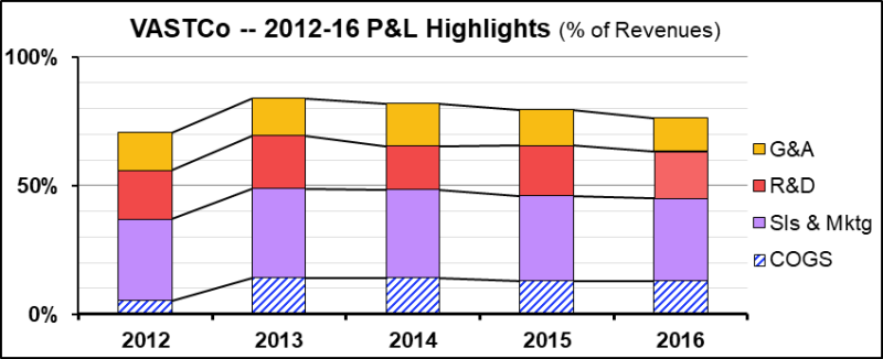
Again, we learn something: the height of the stacked columns gives us a clear sense of the operating margin (although correlating lower height with higher profit may be visually counterintuitive), and we do have some visual sense of how each expense component has changed over time – note the series lines, which give us some additional sense of whether each category’s share of expenses has increased or decreased. But every FP&A analyst worth his salt can come up with yet another set of “unfortunatelys”.
Perhaps by now, you’ve noticed something: Graphs are usually only useful for making one or two points. If you have more points to make, you need more graphs… or show the information in a table instead. This is a fundamental truth that every FP&A professional ignores at his/her peril.
Wait, though, we’re not quite finished with this topic. A particularly poor – but increasingly widely-used – choice is graphs that are based on area rather than on a single dimension (i.e., height or width). An example is a graph I found in the Washington Post, describing the disposition of Jared Kushner’s assets as he moved into his White House role as a presidential advisor:
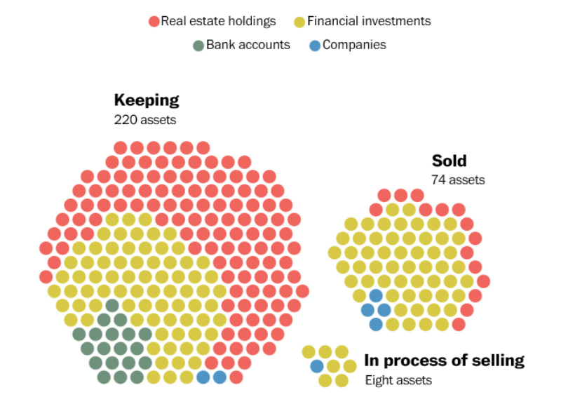
Do you find this graph informative? Personally, I don’t – it’s visually extremely difficult to compare areas side-by-side, and the somewhat random arrangement of dots makes it hard to form conclusions about the separate asset classes. Here are two other ways of presenting the same information, which combined take up less space than the above graph:
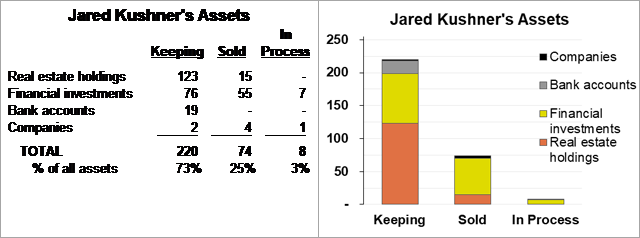
I would be comfortable with either of the above choices – they both provide a good sense of how Kushner is disposing of various types of assets – and the table even includes a key indicator at the bottom that tells the whole story. Now, are you a graphic artist trying to make your newspaper look modern and artsy, or are you an FP&A professional trying to make an important point as clearly and succinctly as possible?
[By the way, a much more serious flaw in all three of the above presentations is that they present the number rather than the dollar amount of assets. Who cares how many bank accounts Kushner owns? And what if the two companies Kushner is keeping have a market value greater than all the rest of his assets combined? I would call this presentation not just meaningless, but possibly dishonest – except that we can’t tell whether it’s overstating or understating the share of assets Kushner is disposing of. The subject of honesty will come up again in a couple of weeks!]
There are so many ways to graph information, and many of them are not just labor-intensive, but cognitively ineffective – area charts, especially the particularly evil pie chart (more on that some other time!), frequently fall into that category. But even if you’ve chosen one of the more effective ways of graphing information, also remember that graphs work best when you’re trying to make a single, critically important point. One of the highest arts, if you want to be an FP&A star, is choosing the chart type that makes that one point most effectively.
The article was first published in prevero Blog
We will regularly update you on the latest trends and developments in FP&A. Take the opportunity to have articles written by finance thought leaders delivered directly to your inbox; watch compelling webinars; connect with like-minded professionals; and become a part of our global community.


Lindaxu
June 26, 2021